
The best hot dog in New York? That's a no-brainer: Papaya King. Even Julia Child said so. "Tastier than filet mignon," is the mantra at its iconic Eighty-sixth Street storefront, a neon-decked, mustard-yellow institution since the 1930s. In a few short weeks, this signature New York establishment will be coming downtown for the first time, to a storefront on St. Mark's Place.
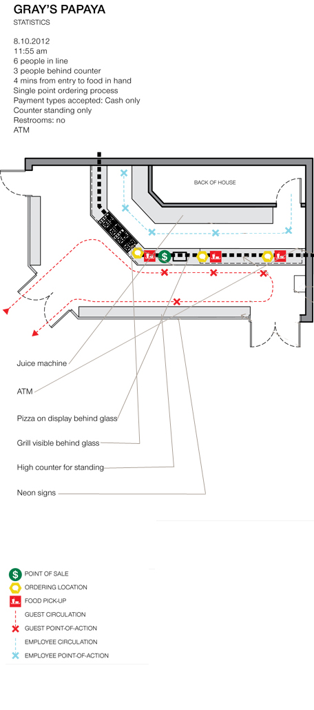
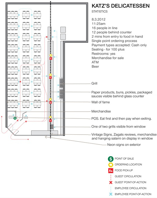
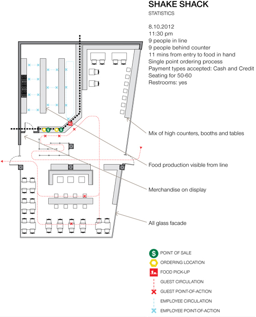
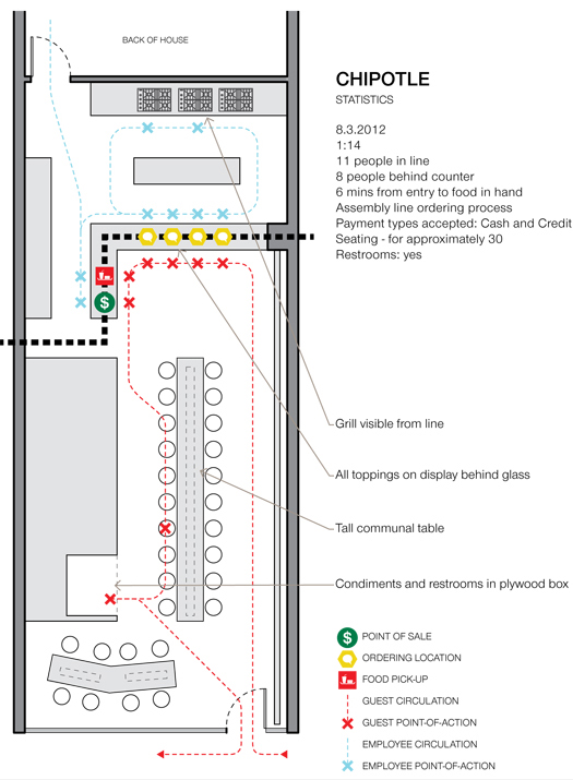
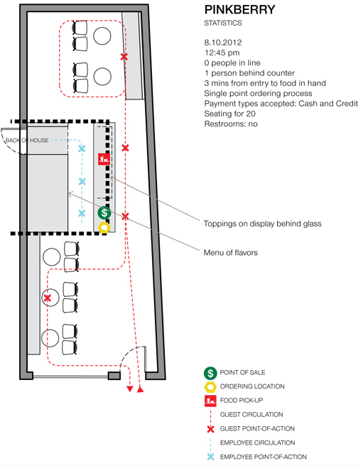
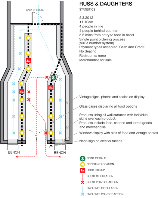
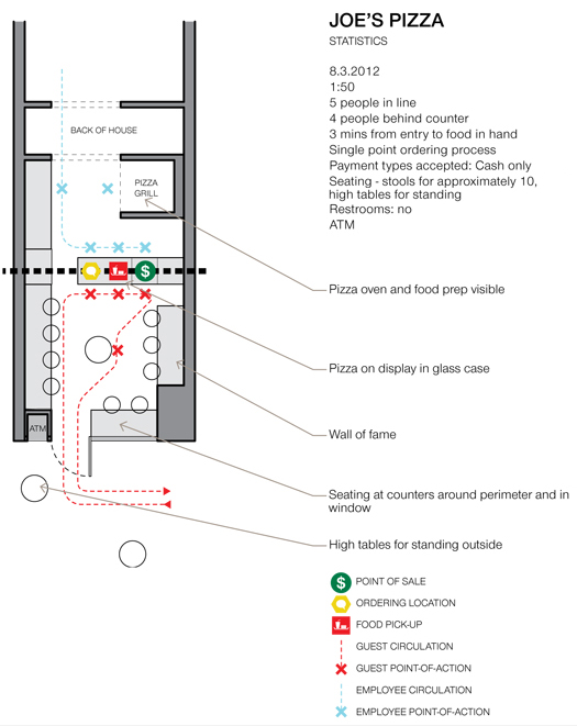
How do you design an outpost of a legendary fast-food joint without losing its character? For that matter, what are the design challenges inherent in the design of any quick-turnaround restaurant? Papaya King's architect, Andrew Bernheimer, took a rather analytical approach to these problems. Reproduced in the following slideshow are diagrams made by his office after careful examination of a series of New York dining institutions and other fast-food restaurants, from Katz's to Shake Shack to Joe's Pizza. Following the slideshow is an interview with Bernheimer, in which he discusses what, exactly, they learned from this exercise.
ML: So what possessed you to go and map out all of these fast food joints?
AB: We wanted to “measure” other New York standbys, to know what the experience was as a consumer from a quantitative as well as a qualitative standpoint. We’ve all been to these simply to order and eat, but we don’t actually measure them. Two people from the office did a lot of the field work, Alexandra Burr and Matthew Storrie, in compressed fashion.
ML: What do you mean "measure"? What specifically were you looking to discover?
AB: Patterns and standards, as well as unique or idiosyncratic techniques of sales or consumption.
ML: So is there any unique standard you discovered? Is there something that all of these places do? And on the reverse of that coin, are there ways that they distinguish themselves from one another, if at all, beyond graphics? Do different food types have different typoiogies?
AB: They stuff you with calories. More seriously, there is certainly a play of desire for efficiency (serve as many as fast as possible, e.g., Gray’s Papaya, no atmosphere other than paper pineapples) with a desire for environment (newfangled places like Shake Shack and Chipotle, who want to serve as many as possible as quickly as possible but which also value design). Also, linearity. Lines. Tracks. Paths. Don’t wander. Get in line. Get out of line and eat.
ML: So what, logistically, is the biggest challenge, or challenges, in designing one of these places, and did your research reveal any "truths" about how to go about doing so?
AB: Garbage cans and recycling bins are tough — they need to be big (so they don’t have to be emptied every three seconds) and that means they take up space, but of course as modern designers we want to conceal them and integrate them (which means they aren’t in their best location and need to have something built for them, which means money). At Papaya King, we buried them in a long communal table in the center. Also, ketchup, mustard, all the stuff that goes on the food — condiments are tough.
The biggest “truth” was the line — make the line clear, make the line move, and give just enough space so the line isn’t invasive to those eating but enough so that the line gets seen, that the line is a visible element. Lines mean popularity, they don’t always just mean a long wait. People like to go to popular, quality places.

ML: I think at fast food joints we're conscious that we're in a very controlled environment, but perhaps don't realize (because we are in a rush), just how manipulative that space can be. How did you see this playing out in the places you looked at?
AB: It ranged. Artisanal places (like Russ & Daughters) don’t feel manipulative in an insidious way at all (other than showing off some great food and triggering all sorts of synaptic response), while others do (Five Guys and their peanuts, a pretty nasty and obvious trigger to go order soda or spend money on WATER). We didn’t just look at fast food joints, but also icons of New York (R&D, Katz’s) that do try to serve people quickly but I don’t think qualify as “fast food joints.” In these cases the manipulation is either entirely subliminal and beyond recognition, or it has been rendered unnecessary because a place has become iconic, the domain of the “regular.”
ML: So how do you design a place that retains the je-ne-sais-quois authenticity of an iconic New York place without it becoming a generic franchise joint?
AB: Use the language of their original store, and then deploy elements in slightly different ways. Don’t merely replicate things. For example, we decided to push the entry in from the street (the opposite of the original incarnation, which occupies a prominent corner on the Upper East Side) and widen it, to create a sheltered entry space. And we made it bright yellow, which picked up on their color scheme. Also, signage is really important. Sometimes we are taught in architecture school (or later on, learn in practice) that nostalgia isn’t valuable, and our impulse is to fight it. But in this case nostalgia was important, very much so.
ML: Last question: Ketchup or mustard?
AB: As a point of principle I don’t believe ketchup should be allowed in a hot dog restaurant.

This essay was originally published in April, 2103.


Comments [6]
Also, if there's a way to get us a close up of the slides, that would be very welcome too, as the text is quite small in some of the blueprints.
04.01.13
12:21
04.01.13
01:56
I'm confused. Is this architect studying or building a new papaya king?
04.01.13
06:49
04.02.13
10:46
It's also the type of institution that could only exist in New York, or at least a dense urban area with much foot traffic.
04.02.13
01:19
04.03.13
12:20