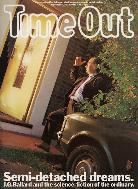
J.G. Ballard by Brian Griffin, Time Out, November 2-8, 1979. Art director: Pearce Marchbank
I have kept this magazine cover showing the writer J.G. Ballard for 35 years. The image hasn’t previously appeared online and it deserves to be seen. Of all the portraits made of the visionary British author, who died in 2009, this picture is, in my view, one of the most “Ballardian” and one of the best.
Ballard always cooperated with photographers, but he wasn’t a naturally expressive person in front of the camera. In the mid-1970s, Brian Griffin, who took the picture, had developed a surreal, conceptual approach to portraiture, working for the British magazine Management Today. “I think my photography does not record visible reality,” he notes in a catalogue from 1987.
The portrait was commissioned by Time Out’s art director, Pearce Marchbank, who was responsible for some of the most striking cover designs of the era. “I wanted it to look like an alien had just landed in his doorway,” Marchbank recalls. The picture shows Ballard’s home in Shepperton, a suburb to the west of London. Ballard divided his days between full-time writing and bringing up his three children after his wife died, and the upkeep of the modest, semi-detached house was always low in his priorities. For metropolitan journalists who came to interview him, his home and its location in stultifying suburbia never ceased to provoke mystified comments.
Ballard took a more perverse and celebratory view of Shepperton. He had just published his novel The Unlimited Dream Company—the reason for Time Out’s cover story—in which he transfigures the town into a tropical phantasmagoria alluded to obliquely in the photograph by the unnatural light emanating from the house, the picture’s unsettling tilt, and the cascading foliage. The estate car parked aggressively right up to the domestic threshold signals Ballard’s automobile obsessions in his exhibition of crashed cars and in the notoriously extreme novel Crash, also set in the vicinity, which had been published six years earlier. Griffin made a more conventional picture, with Ballard turning to the camera, used alongside the interview, and in his book Work (1988) he shows a third image from the session in which Ballard, shielding his face with a hand, is seen through the doorway, sitting on the car.
The cover’s undiluted power as an image comes from the editor’s willingness to allow this to be the single cover story. The cover lines and even, on this occasion, Time Out’s masthead, glowing pure white, become intrinsic to the concept. A cover image as uncompromisingly eccentric as this, simultaneously mundane and inexplicable, would be unlikely to make it on to a British consumer magazine today.See all Exposure columns

