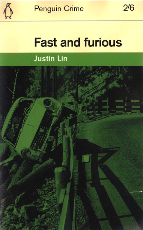
Faux book cover by Julian Montague, 2015. Photograph by Arnold Odermatt, 1966
Inventing titles and authors for books that don’t exist is a frequent device in fiction, and graphic designers have taken the game to the next stage by visualizing the covers of entirely fictitious publications. Julian Montague, a designer and artist based in Buffalo, New York, is a master of the seemingly real but phantom cover.
Earlier this year, he took the seven titles in the popular series of car movies that began with The Fast and the Furious (2001) and pumped them into the celebrated cover grid devised in the early 1960s by the British designer Romek Marber for Penguin Crime fiction. Montague recreates the typographic details with precision, including the antiquated price in shillings and pence, and even ages the cover a little, with a tear to make it look like one of the highly collectable originals. Fast and Furious is the fourth in the series and the director’s name stands in as author.
While these maneuvers make for a routine, though amusing graphic homage, Montague’s exacting treatment of the photographs within this framework gives the project a more conceptual edge. All seven covers feature pictures of crashed cars by Arnold Odermatt, a Swiss traffic policeman who became famous for the quality of the photographs he made for his reports. This matter-of-fact shot of a small sedan, which has careened off the road, burst through a fence, and come to rest on a pile of logs, was taken in 1966 outside the Swiss village of Stansstad. Odermatt’s black-and-white original shows both lanes of the empty highway, and Montague has also cropped some of the foreground to bring the forlorn wreck slightly closer.
The picture’s tint is dictated by Penguin Crime’s standard use of green and the effect is almost Warholian. Where Warhol made a point of showing the broken bodies in press photos, in his orange and green car crash silkscreens, Odermatt recorded the scene of the accident after the victims had been removed. There is often not a soul in these pictures, and the shattered vehicles awaiting clear-up have a melancholy stillness. The films deliver absurd amounts of motorized mayhem, in the glamorous Hollywood manner, and Montague undercuts their bluster by presenting the sobering, even banal, reality of the out of control car. We have no way of knowing what happened to the driver, who may have been drunk, or the possible occupants. In Montague’s imaginary crime fiction, the title becomes a shrug of ironic fatalism, and being “fast and furious” at the wheel could lead to an untimely end.See all Exposure columns


Comments [2]
09.22.15
10:24
09.22.15
08:02