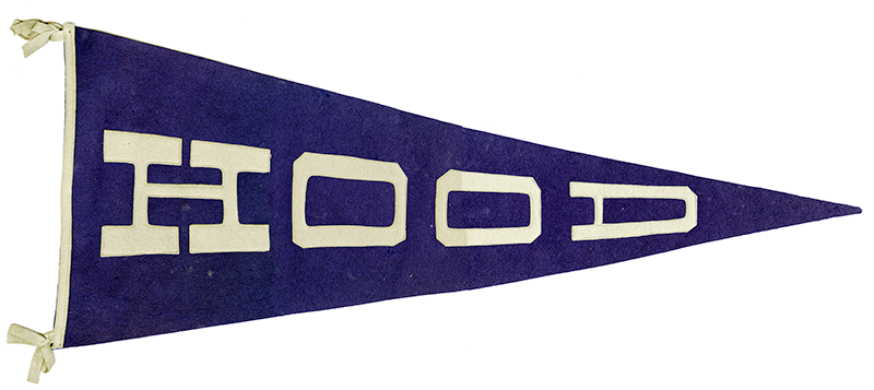
Whether blasphemy or keen observation, the lettering commonly found on felt school and sport pennants is similar to the typography by Russian Constructivist Alexander Rodchenko on his iconic 1925 poster of a Soviet woman screaming into an abstracted megaphone with the typeset word “READ” printed in variously sized cyrillic letters. Of course, there is probably no direct influence, but maybe Rodchenko did take a cue for the pennant. Nonetheless, serious design pundits would scoff at giving the manufacturers of high school and college souvenirs their due for true lettering ingenuity.
While pennant makers are not designers per se, they do routinely follow formulae that go back to the turn of the twentieth century, and it is no small feat filling the tapered triangular space with different sized letters that makes it look like it was meant to be. Type must be made to conform to the pointed shape of the pennant, necessitating the reduction of individual characters in a gradual way.

This c.1940s pennant for Hood College, in Frederick, Maryland, is not a Rodchenko masterpiece, but it is typical of the “gradual diminution of width or thickness in an elongated object” that distinguishes the average pennant from other flags or banners. The word HOOD is set in a distorted hybrid slab serif letter, with a touch of the Victorian, which is one of the dominant letter styles in pennant design.
The pennants’ heritage originates in the Middle Ages when monarchs, knights, and their minions carried pennons on lances that were used to identify a noble and his subjects. The modern pennant was introduced centuries later on England’s Royal Navy war ships—hung from the yardarm by men-of-war prior to 1653, and after that time on the main topgallant masthead. They continued to be standard naval decor for centuries. Then during the second half of the nineteenth century, felt pennants were adopted by organized sports teams for their fans, thus establishing a continuous market for souvenir pennants.
Bold gothic, block letter, Old English, and script letter faces cut from felt or chenille became standard lettering styles. As the pennants grew in popularity (prior to the merchandizing of sports jerseys and caps), anonymous and formulaic typography became embedded in the vernacular, but it is also at the root of a bona fide pop typographic genre that has been mimicked during the later twentieth and early twenty-first centuries by more tutored designers and letters.


Comments [1]
12.23.15
02:58