
J.G. Ballard, “Advertiser’s Announcement,” first in a series, in Ark no. 42, London, 1968. Photograph: John Blomfield
From 1967 to 1970, the British author J.G. Ballard published a series of disturbing conceptual ads in several periodicals at his own expense. The five “Advertiser’s Announcements,” as he called them, have been part of discussion about Ballard since they were reproduced as a set in Re/Search no. 8/9 in 1984, with a brief statement by the writer. More recently, they have been reprinted in catalogues for Ballard exhibitions in Barcelona (2008) and London (2010) and in David Brittain’s book Eduardo Paolozzi at New Worlds (2013). Inevitably, copies also circulate on the Internet. While the ads are well known to Ballard’s admirers and scholars, they have always been viewed within the framework of Ballard studies. There has been little attempt to place them in a broader context, in relation to developments in advertising or design.
All five of the ads appeared in Ambit, a literary magazine where Ballard was prose editor, and the first three appeared in New Worlds, where he also published regularly and had close ties. Attention has naturally focused on these highly regarded publications, but in Re/Search, Ballard says that he also ran ads in Ark — a magazine produced by postgraduate students at the Royal College of Art in London — and in “various continental alternative magazines.” Without the titles, it’s impossible to track down these European publications, though eventually something may surface. Ark, which Ballard mentioned again in his autobiography Miracles of Life (2008), is a curious oversight in Ballard studies; it isn’t listed in David Pringle’s indispensable bibliographies. Yet the magazine, published from 1950 to 1978, isn’t obscure and old copies can easily be found. In 1995, Ark was the subject of a detailed study, Alex Seago’s Burning the Box of Beautiful Things (Oxford University Press), based on his doctoral thesis.
Only one of Ballard’s ads, the first in the series, appears in Ark, in issue 42 published in 1968 — it had run the previous year in Ambit no. 32 and New Worlds no. 176. (Why he decided not to continue placing ads in Ark isn’t known.) The ad features a single smiling picture of Claire Churchill, later known as Walsh, who was his girlfriend at the time and his companion until his death. “I was so impressed by Claire’s beauty that I made her the centrepiece of two of my ‘advertisements’,” Ballard writes in Miracles of Life. The image could be about anything until one reads the bizarre copy lines:
Homage to Claire Churchill, Abraham Zapruder and Ralph Nader. At what point does the plane of intersection of these eyes generate a valid image of the simulated auto-disaster, the alternate deaths of Dealey Plaza and the Mekong Delta. The first of a series advertising: (1) Claire Churchill; (2) The angle between two walls; (3) A neural interval; (4) The left axillary fossa of Princess Margaret; (5) The transliterated pudenda of Ralph Nader.
This is then signed with a mogul-like flourish: “A J.G. BALLARD PRODUCTION.”
Readers in the 1960s would immediately have got the references to President Kennedy’s assassination in Dealey Plaza caught with a cine camera by Abraham Zapruder; to the Mekong Delta, zone of savage fighting in the Vietnam War, seen nightly on TV screens around the world; and even to the automobile safety campaigner Ralph Nader, author of Unsafe at Any Speed. Princess Margaret’s axillary fossa (armpit) might have posed more of a challenge to the non-medical reader. But getting the references doesn’t mean they add up to any obvious message, particularly when their obscurely menacing tone — auto-disaster . . . alternate deaths . . . transliterated pudenda? — is weighed against the pleasing picture. A tremendous compression of ideas, associations and connections is clearly at work here.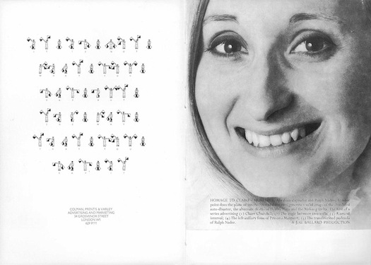 How J.G. Ballard’s ad appeared in Ark no. 42: opposite an ad for the Colman, Prentis & Varley advertising agency
Even for those who know the ad and the series, it is worth taking a look at its presentation in Ark. The effect is much closer than elsewhere to what Ballard seems to have intended with this project. In Ambit, the five ads were shown on the back cover until one of them was reprinted in 1974 on the inside cover facing the contents page (see below). In New Worlds, one faced the contents and two were back covers. Neither publication featured full-page advertising of the kind found in consumer magazines, or indeed many ads at all. Ballard’s ads came from a star writer readers would recognize and they were all signed. They were just as likely to be interpreted as another kind of editorial illustration as “advertising,” even though Ballard paid the going rate to place them. In Ark, where he was never a contributor, Ballard would have been less familiar to the wide, mixed readership and his ad is embedded in a 19-page sequence at the back that includes ads from Courtaulds, National Provincial Bank, Crossley Carpets, London Magazine, ICI Fibres, Letraset, and the travel company P&O. The issue’s advertising and production managers have placed it opposite an ad for the Colman, Prentis & Varley advertising and marketing agency. They also dispensed with the credit lines — “Photo: John Blomfield/Advertiser’s Announcement”— that ran in a white strip above the ad when it was shown elsewhere, and moved it to the top of the page to achieve a harmonious relationship between the facing ads. The little men with flags, semaphoring the message, “It is not what you say but the way that you say it,” occupy a similar position to Walsh’s eyes and mouth.
Colman, Prentis & Varley’s ad is typical of its time. It puts across its message with economy and a modicum of visual wit, but the concern with surface it espouses, like a populist version of McLuhan’s “the medium is the message,” is only skin deep. Advertising has always aimed to deliver a simply grasped proposition with the least amount of fuss and ad people still think this way. “If your idea or message is too complicated it will bewilder and confuse your audience,” advises the adman John Hegarty in a new book. Ballard’s opaque conceptual ad, on the other hand, is a sophisticated kind of détournement in the Situationist sense. It appropriates the form of its surroundings — visually it’s the most impactful ad in the issue — shatters the expected link between the image and the text meant to support it, and scrambles the ad’s signal into irreducible complexity. There can be no shared answer to the Surrealist question it poses about the point at which the plane of intersection of Walsh’s eyes would generate a “valid image” of these disasters.
By 1968, when he gave a radio interview to Jannick Storm, Ballard had produced two more ads, “Does the angle between two walls have a happy ending?” and “A Neural Interval” — as proposed in the first ad. “It occurred to me about a year ago,” he says, “that advertising was an unknown continent as far as the writer was concerned, a kind of virgin America of images and ideas, and that the writer ought to move into any area which is lively and full of potential.” (Advertising wasn’t unknown to Ballard, though. He had worked very briefly as a copywriter at the start of his career.) Ballard imagines how such ads would look in the pages of newsstand magazines. Readers can skate over abstract ideas in the middle of a short story, but the directness of an ad would make people stop and think, he speculates. “I wanted ads that would look in place in Vogue, Paris Match, Newsweek, etc.,” he recalls in Re/Search no. 8/9. According to a story in the Sunday Times (London) in 1967, titled “J.G. Ballard: Advertising is the Medium,” he approached the Arts Council for £1,000 to back his campaign, but they refused to support him with a grant, which still rankled decades later.It’s remarkable that Ballard stuck with a project he was obliged to fund from his own pocket for as long as he did, but he seems to miss the point slightly when he suggests to Jannick Storm that he hopes in time, “the magazines will pay me to put advertisements in their pages.” Were this unlikely scenario ever to have occurred, the ad (whatever it happened to look like) would then have become an editorial contribution on the same terms as any other. The disruptive potential and ultimate radicalism of Ballard’s ads lies in the idea of perverting the commercial transaction that cements the publisher-advertiser relationship to serve literary and artistic purposes deeply antithetical to the underlying assumptions of advertising.
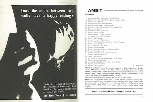 J.G. Ballard, second “Advertiser’s Announcement,” Ambit no. 60, 1974 (first published in issue 32, 1967)

Still from Alone, directed by Stephen Dwoskin, 1963. Although not exactly the same as the still
Ballard used, this shows the extent to which the image has been “posterized” for the ad. John
Blomfield, usually given a photo credit on the ad when it was printed, was presumably responsible.
Source: British Artists’ Film and Video Study Collection
Just how far Ballard was prepared to go by the decorous standards of 1960s advertising can be gauged from the ads that followed “Homage to Claire Churchill.” In the “Angle between two walls” he borrows a still from Alone (1963), an experimental film by Stephen Dwoskin, which shows a woman masturbating. (He admired Dwoskin’s work and wrote about his film The Bathroom in 1968.) “A Neural Interval” features a woman in bondage gear, a cutting from the image library of his friend Eduardo Paolozzi. In the fourth ad, “Placental Insufficiency,” Ballard crops a picture of a gun-toting woman titled Nudist Willing to Defend Her Home (1968) by the American photographer Les Krims; he was unable to say later where it had come from. The final ad, “Venus smiles,” is another homage, of sorts, to Claire Walsh, a candid snap taken by Ballard after she emerged from a swim in the sea speckled with seaweed, as he later revealed. This information (Ballard was clearly besotted) normalizes an image that could easily seem abject in atmosphere. In each case, Ballard’s compressed texts add layers of complication to already ambiguous pictures.
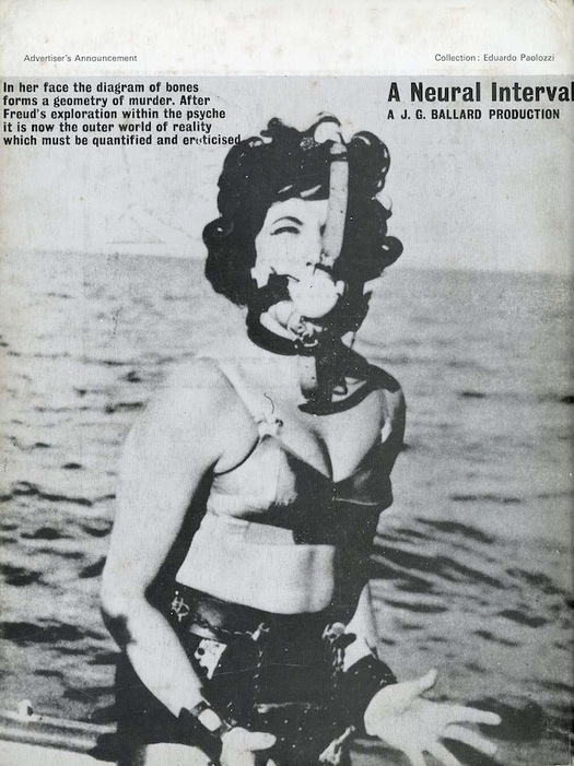
J.G. Ballard, third “Advertiser’s Announcement,” Ambit no. 36, 1968 (back cover)
J.G. Ballard, fourth “Advertiser’s Announcement,” Ambit no. 45, 1970 (back cover)
Les Krims, Nudist Willing to Defend Her Home, Rochester, New York, 1968. Source: Les Krims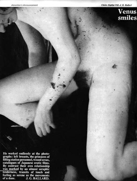
J.G. Ballard, fifth “Advertiser’s Announcement,” Ambit no. 46, 1970 (back cover). Photo: Ballard
Source: Rick McGrath, The Terminal Collection
These ads are so familiar now in Ballardian circles that their content is taken for granted. Placed in a wider arena such as this one, they remain uncomfortable to look at and, in their unrelenting focus on the female body, may give rise to familiar concerns about the power relations inherent in the imperious male gaze. Readers acquainted with Ballard’s writing and biography — his boyhood experiences in Shanghai in the Second World War; his two years as a medical student; the sudden death of his wife Mary when his children were young — know that tenderness, affection, anger, provocation and brutal clarity in picturing the body and its processes are fused in the same vision. “I was trying to construct an imaginative logic that made sense of Mary’s death and would prove that the assassination of President Kennedy and the countless deaths of the Second World War had been worthwhile or even meaningful in some as yet undisclosed way,” wrote Ballard near the end of his life. He was talking about the “condensed novels” that comprise The Atrocity Exhibition, but the same is true of the even more stringently condensed ads, which he spun from the imaginative logic of the texts he was writing at the time for that clinical mind-trap of a book. (For more on the links between the ads and Ballard’s fiction, see Rick McGrath’s two-part essay at Ballardian.com.)
In his series of ads, as with his typographic experiments in the late 1950s, Ballard moved far from the conventional domain of the fiction writer and became a visual artist and designer. Prescient in so many ways, he challenged the conceptual limitations of advertising, hijacked its techniques for his own ambivalent purposes, and anticipated the way that advertising space would become a pressure point and site of furious contestation. There is a direct line between the Ambit/New Worlds series and Barbara Kruger’s later art-world subversions of advertising formats, language and style. By the 1980s and 1990s, advertising was a regular target for culture jamming and billboard modification in the work of Adbusters and many others who questioned its dominance as public speech. Jeffery Plansker’s “subvertisements” (see examples spliced into this pop video) and Shawn Wolfe’s absurd advertising campaigns for the “Remover Installer” and other products that don’t exist are conceptual descendants of Ballard’s ads.
Yet, when making these comparisons, Ballard’s concepts can still seem the most provocative, despite some minor defects of design, because they are less obvious in purpose than critiques based on parody that set out to attack advertising and he is a much better writer. His motivation wasn’t to criticize the medium, even though this is an implicit side effect, but to use it as a delivery system for disseminating personal, writerly intimations of unease about the violence of the time and its media representations. Just as his stories and novels were aligned with the speculative writing coming from the new wave of science fiction, so the “Advertiser’s Announcements” can now be seen as oblique early examples of a kind of work we have come to describe in the last few years as design fiction or speculative design.
See also:
Ballard’s The Atrocity Exhibition at Pinterest
Ballard’s Crash at Pinterest
What Does J.G. Ballard Look Like? Part 1
What Does J.G. Ballard Look Like? Part 2
J.G. Ballard’s Terminal Documents


Comments [2]
04.20.14
12:25
04.20.14
11:46