Boards by Rick Poynor at Pinterest, January 2014
A week ago on a sudden whim I joined Pinterest. I have always liked the site’s exclusively visual focus and the unlimited “boards” structure that allows pinners to group images by theme. That seems to me a great advantage over Tumblr’s month-based archival structure as a way of collecting, organizing, sharing and, over time, retrieving images. It occurred to me that Pinterest would provide a good way of addressing an issue that becomes more obvious the more I write for DO. After an essay has fallen off the bottom of the Observatory list of a contributing writer’s 10 most recent posts, it ceases to have a visual presence — best achieved with an image — and sinks into the shadows of the archive. Everything remains findable, using essay titles and descriptions, but only by making some effort. Serendipitous discovery by browsing is less likely.
The best solution is some kind of visual contents page or index, giving each story or item its own image-based “front cover.” I have seen this done with great success on a handful of writers’ websites — the British photography writer David Campany’s is a good example. Pinterest provides an off-the-peg way of achieving the same kind of effect. My posts are often full of images and I view their selection and placement as being as crucial to what I am trying to say about the subject as the writing. The images are also a declaration that the pleasure of the visual is a key motivation in writing about and discussing visual subjects. (I find it hard to trust any writer working in this area that doesn’t appear to experience this pleasure, or won’t own up to it.) I have noticed plenty of pictures that come from my DO writings, indeed from my own library, collection and scanner, doing the rounds on Pinterest, so why not embrace the inevitability of this casual traffic in images and join the process on one’s own terms?
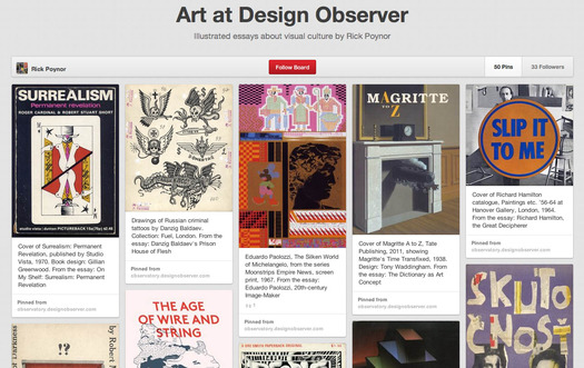
 Art at Design Observer board at Pinterest
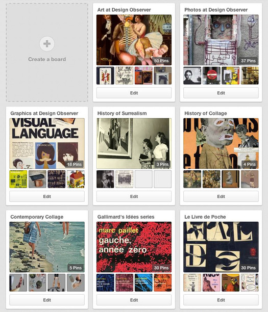
I began with a board catholically titled “Art at Design Observer,” which covers essays about illustration and poster image-making, as well as fine art. Then I added “Photos at Design Observer,” featuring posts about photography and visual essays based on my own pictures, and “Graphics at Design Observer,” which is self-explanatory. Inevitably, there is overlap between these groups. My ultimate interest as a writer lies in the way all of these visual activities interconnect and fuse, but some degree of categorization gives order to the pile of posts. Each essay is represented by a single image, which comes with a link to the original post, where along with the text there are more images to be seen and perhaps pinned.
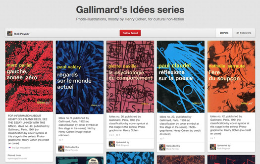
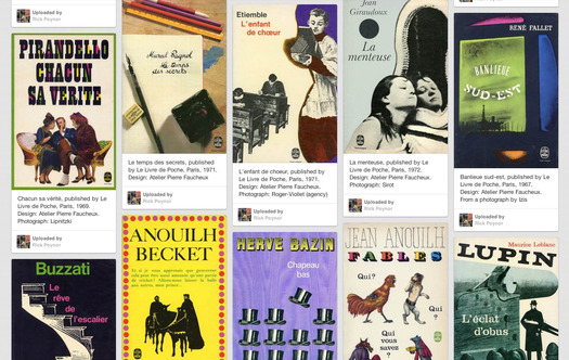
No surprise to find that Pinterest is as compulsive and potentially addictive as it appears when browsing. I started three other boards representing enduring interests in the history of Surrealism, in the history of collage, and in contemporary collage. Not much progress with those so far. I’m also planning to create boards devoted to compiling visual material relating to particular essays. The first two are both about 1960s and 1970s French book cover design for Gallimard’s Idées series, which I wrote about for Eye, and for Le Livre de Poche, subject of a DO post. My boards will range widely while following my interests and tastes.

Gallimard’s Idées series board at Pinterest. Photo-illustrations by Henry Cohen
In visual case studies based on previous writing, I will include a link to the original essay where some, but not all, of the visual material can be found. I have uploaded images not shown in the original article. I don’t know yet how other art and design writers are using Pinterest to support their own image research, analysis and writing, but it clearly has great potential. I remember being struck by Alexandra Lange’s “Thinking in Tumblr” post, in which she argues that a Tumblr might replace a dissertation or a book. I found that intriguing and persuasive, but I think Pinterest’s structure comes closer to that ideal. Le Livre de Poche board at Pinterest. Designs by Pierre Faucheux and his atelier
Two years later, Pinterest’s stock has risen. Some image collectors have been hyperactively busy on the site. One pinner I quickly decided to follow, Wayne Ford, a designer who sometimes writes for Eye, has 53,000 pins across 193 boards. This makes me wonder what the optimum size of a board might be. After even 50 pins they can start to look image-heavy and clogged. Beyond 100 pins it’s a long scroll to the bottom and impossible to make rapid visual connections with the top of the board. Where’s the line between illumination of a theme by judiciously chosen examples and overdoing it through repetition and clouding the issue? It seems as though even a medium as informal, elastic and idiosyncratic as a digital pinboard must benefit from some care in editing.
Only a week in, I have done barely any pinning from other boards on Pinterest and I’m only just starting to follow a few that look promising. After years of fact checking as an editor and caption writing as a journalist and author, I find I’m reluctant to pin any image that isn’t clearly identified by maker, title, date and place of origin. And I don’t just mean that slippery word “via,” which passes responsibility to the previous person in the chain. If it’s necessary to double-check a Pinterest pin outside Pinterest to discover or verify such elementary information, then why not pin from that more reliable source instead?It’s both exhilarating and curious to see this ceaseless torrent of deracinated images passing from hand to hand, admired and valued for their visual properties, yet often torn loose from the contexts that allow their meaning to be fully appreciated. That might be how private scrapbooks and wall-mounted pinboards operate, but Pinterest pins are both personal tokens and public communication. Taking pleasure in a picture doesn’t rule out the need for some curatorial precision. Amassing these collections is undeniably satisfying, though. When I have gone a bit further, I know I will want to write about Pinterest again.
Rick Poynor at Pinterest


Comments [1]
Thanks for the fine post. I'm very pleased you picked up on my website, designed by the very fine Christian Nolle of www.goodcaesar.com. Although I write about photography, two of my primary interests are image editing and the relation of image to text. Most of my writing begins with an entirely visual structure i.e. a string of images in a sequence that will map out the development of the written thinking. The aim was to reflect this in every aspect of the website design.
The second challenge was to provide a site that was also an archive. I mainly post my past essays from out-of-print books and magazines, along with extracts from recent print publications. Christian would only consent to design the site if PDF's were forbidden: no print-based formats on the web! So rather than replicating the original layouts, which I often had a hand in influencing, he has tried to come up with web templates that are sensitive to the variety of original printed matter.
I've only had the site six months so it's early days yet. I'd be very interested to know about good examples of websites of writers on visual culture.
Sincerely
David Campany
www.davidcampany.com
01.13.14
05:49