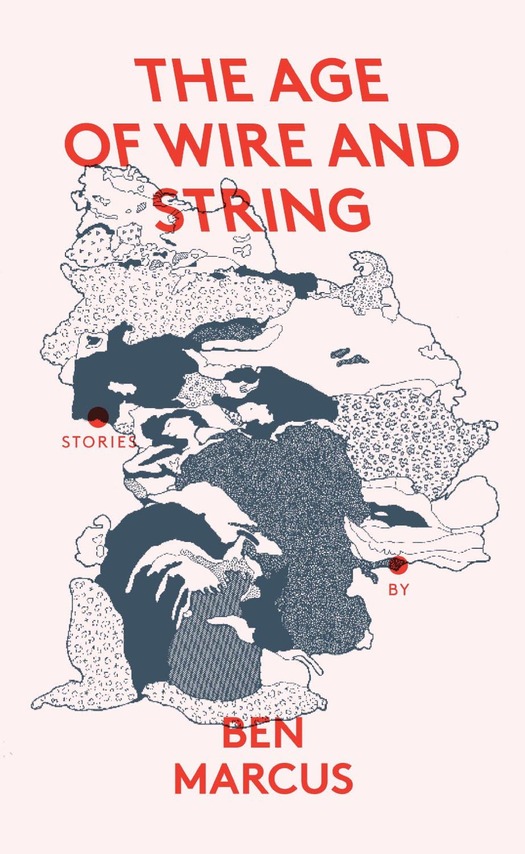
Illustration by Catrin Morgan. Design by Julia. Published by Granta, 2013
The Age of Wire and String by Ben Marcus, first published in 1995, is one of the strangest works of fiction I have read. What and where is the world it describes with such dedicated observational precision? The language has an almost biblical sonority, and these brief “stories” might seem to offer a set of rules, or a guide to living. Large parts of the book sound like a report on a field trip written by an extraterrestrial anthropologist about a planet where life has evolved in ways that resemble our human existence in key particulars while being utterly unlike it. Or it could be that we are the subject and a visiting alien ethnographic entity cannot make sense — at least not a sense we can fully grasp — of what it has found. Almost any quotation will serve to give the flavor. Here’s the opening of a section titled “Hidden Food, From Above”:
The chief legal problem connected with hidden food is that of title. A scavenger cannot acquire title to chicken that he has discovered abruptly, and therefore he cannot transfer title even by barter to an innocent dining man who has requested a stew. Hence the rightful owner of the chicken may take it without compensation from anyone who has not properly tracked it according to the rules set forth by the Topographical Legend and Location of Food Nooks.
Our feeling of estrangement comes in part from from otherwise familiar syntax and terminology made elusive and strange. There are many references to American states and cities (Ohio, Montana, Buffalo, Denver) that are no longer places we can recognize, and ordinary names (Carl, Frederick, Winter Albert, Stephen) that sometimes represent things rather than people. Each of the sections, with titles like Sleep, God, Food, Weather and Persons, as if in a textbook survey, ends with an attempt to clarify the mounting nomenclatural confusion with an authoritative glossary of terms. Here we learn about Air Tattoos, Choke Powder, Weather Birthing, the Mouth Harness, the Fudge Girdle, Subfeet Walking Rituals, Drowning Wires, and the “Ben Marcus,” defined for our illumination as “False map, scroll, caul, or parchment.” Naturally, these bizarre explications only deepen the mystery.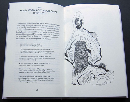
Illustration by Catrin Morgan
A new edition from the London literary publisher Granta has pulled off the improbable feat of making The Age of Wire and String seem even stranger. The book is illustrated by Catrin Morgan, a British artist and illustrator studying for a PhD in the School of Visual Communication at the Royal College of Art. I’m not sure that the word “illustration,” at least in its traditional sense, is fully adequate to describe work like Morgan’s, and she told me recently that colleagues in the illustration field insist that her images are closer to art. She rejects this because her work is grounded in an interpretative dependency on narratives that inspire her, and she argues for the possibility of an expanded definition of the practice.
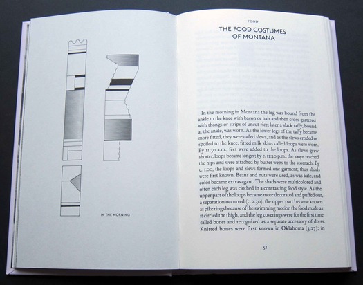
Illustration by Catrin Morgan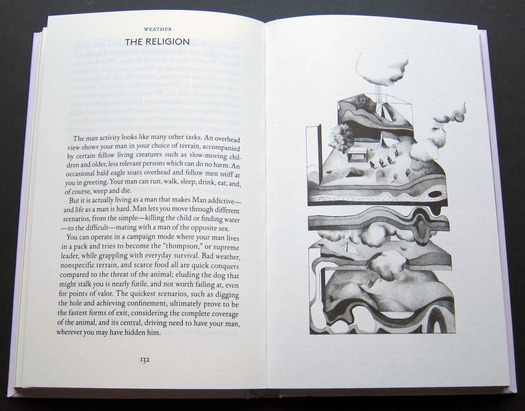
Illustration by Catrin Morgan
Illustrated editions of adult fiction are rare, and in terms of the number of images alone, Morgan’s involvement goes way beyond the norm for a typical illustrated book. Almost every spread has one or more images, many of them scientific and diagrammatic in style, reflecting the text’s uncertain explanatory status. Others, usually in pencil rather than ink, are more representational, showing peculiar events, relationships, rituals or dwellings. Morgan’s fastidious depictions accentuate Marcus’s disorientating perspectives with a comparable slipperiness of form and ambiguity of content. When I showed the book to a friend he mistook the linear cover image for a map until he noticed the two small figures sleeping under a section of the “landscape,” which then assumed the appearance of a blanket. Other illustrations display the same morphing of one thing into another, blurring the distinctions between building types, geological phenomena, and the internal structures of anatomical parts. Morgan gives the explanatory terms free, double-page graphic translations into the shape of a weather system, bar chart, dissected organ, site plan, or turbulent nocturnal cloud.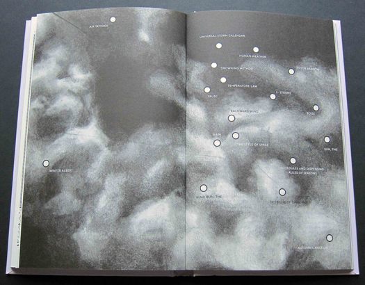
Illustration by Catrin Morgan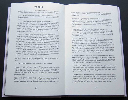
Design by Julia. Typeface: LL Brown
The book’s design by Julia — Morgan’s husband, Valerio Di Lucente, is a member of the three-man team — subtly compounds its oddity and significantly changes its rhythm as a reading experience. I also have a copy of the first UK hardback edition, published in 1997. Despite the division of the text into so many short, headed sections that are sometimes no more than a page long, the earlier edition feels like a unified whole because the text size remains the same throughout, as in any novel or collection of stories. Julia disrupt this continuity by putting the terms and other passages into a second, sans serif typeface, LL Brown, and a markedly smaller type size (the main text face is the ever-so-slightly awkward DTL Elzevir). This adds to the sense of the image-laden book being a series of discrete elements rather than a whole. But I don’t think this matters, given the enhanced visual dimension, though the unillustrated 1997 edition remains, for me, a less choppy read in purely typographic terms, if that’s not a reductive reaction to a book this challenging.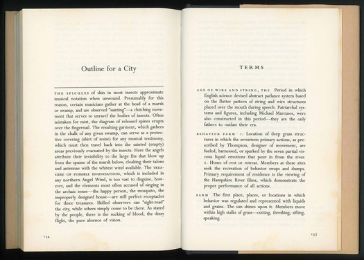
The Age of Wire and String. Published by HarperCollins, 1997. Typeface: Perpetua


Comments [1]
textually, its like a collaboration between eliot weinberger and reeves and mortimer. sublime.
05.15.13
06:57