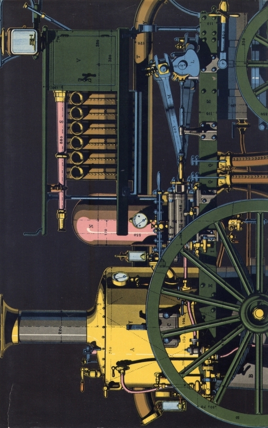
A History of the Machine by Robert Soulard, Leisure Arts Publishers (third British edition), first published 1962.
Designed by Erik Nitsche
Recently I needed to give a talk about the integration of type and image for PhD and MPhil research students in art and design at the Royal College of Art. I scanned my shelves looking for an illustrated book that would perfectly embody what I wanted to say. It didn’t take long. As soon as my eyes landed on the spine of A History of the Machine I knew I need look no further for an example to photograph and discuss. The volume, designed and published by Erik Nitsche (1908-98), is one of the most beautifully measured and visually lucid books I own.
Nitsche’s history belongs to a series of 24 publications titled The New Illustrated Library of Science and Invention, launched in 1962 in Geneva by his company, Erik Nitsche International (ENI). Each book conforms to the series’ style and any of the titles could be singled out to exemplify the project. The books are now highly collectable and one day I might acquire a few more. I bought this copy around 15 years ago from the London shop of Paul Rennie, then a collector and dealer, now also an author and academic. Rennie went on to write an article about Nitsche for Eye (not yet online).
The proportions of A History of the Machine make it immediately striking — it’s like a widescreen film format turned on its side. In this case, though not on other titles, Nitsche emphasizes the point by rotating a landscape picture of a steam engine to fill the space (all the books confine the title to the spine). The shape works so well that one wonders why it hasn’t been used more often for picture books; it provides a generous page area while keeping the book relatively light and easy to handle. The grid Nitsche devised to reconcile the demands of free picture placement and readability could hardly be bettered. The top line of the type column falls almost a third of the way down the page, there is another ample margin at the foot, and the type area consisting of two columns is close to square. The rectangular block formed by having up to four short columns on a spread gives the book a strong horizontal axis — a feeling of lateral momentum — in addition to the pronounced vertical axis defined by the page’s height.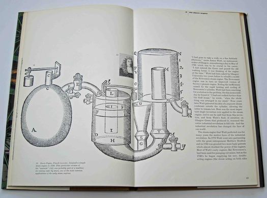 Pages 42 and 43. Chapter 3, The Steam Engine. Illustration: a steam engine invented by Denis Papin in 1690
In lesser hands the proportions might have been restrictive or awkward, but Nitsche fits his visual material — he did much of his own picture research on the series — into the spaces available with consummate control. On chapter openings, a suitable image will often cross the gutter, sitting within the area defined by the text grid, and lock into position beside a single righthand column. Good editorial designers have always tended to think of their visual sequences in cinematic terms, treating each page turn as the equivalent of a film cut within a developing visual narrative. Nitsche’s control of visual flow, scale, contrast and negative space is masterly; the book could be studied as a primer of effective page design. He works effortless variations in his layouts and, in his tender handling of the pictures, displays an acute feeling for the structural precision, intellectual elegance and graphic excitement of mechanical form. The occasional use of color has tremendous impact amid the dark black-and-white rotogravure printing. Showing an intuitive understanding of how a reader’s attention works, Nitsche maintains an exceptional level of visual interest without ever making the error of overloading the page (which we are much too ready to do now) and browbeating readers struggling to concentrate on absorbing the text.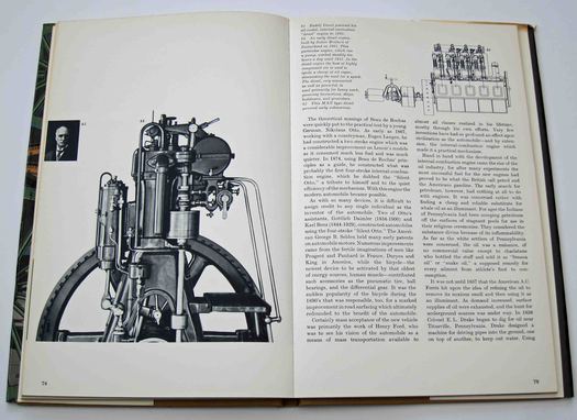 Pages 78 and 79. Main illustration: an early diesel engine built in Switzerland in 1903
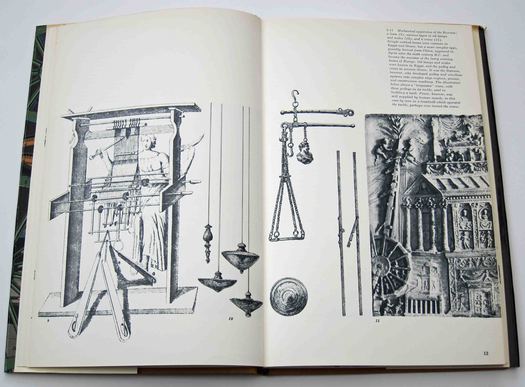
Pages 12 and 13. Mechanical apparatus of the Romans: a loom, oil lamps, scales, a crane 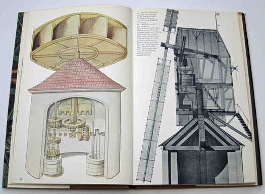
Pages 24 and 25. Left: wind-powered water pump, 1754. Right: late 18th-century post windmill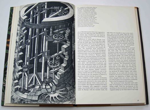 Pages 26 and 27. A system for raising water illustrated in a book by Agostino Ramelli, 1588
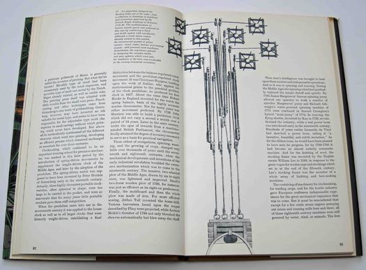
Pages 32 and 33. An apparatus for hauling boats out of the water, France, 1710-40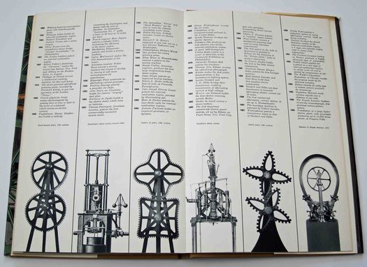 Pages 108 and 109. Chronology at the end of the book
See also:
On My Shelf: A Classic by Berger and Mohr
On My Shelf: Jean-Luc Godard Anthologized
On My Shelf: Continuum’s 33 1/3 Series
On My Shelf: The Metallization of a Dream
On My Shelf: Stefan Lorant’s Lilliput
On My Shelf: Richard Neville’s Playpower
On My Shelf: Nairn’s London
On My Shelf: Surrealism Permanent Revelation


Comments [1]
http://observatory.designobserver.com/entry.html?entry=2277
The posters are remarkable and no reproduction does them justice.
06.10.12
03:35