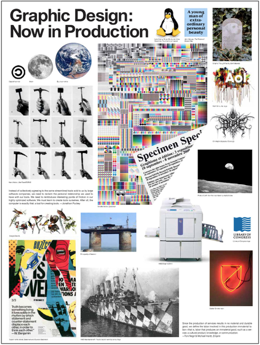
Graphic Design: Now in Production, Walker Art Center, 2011
Catalogue concept: Andrew Blauvelt and Emmet Byrne. Design: Michael Aberman
It’s odd that there hasn’t been more discussion of Graphic Design: Now in Production, the largest and most ambitious American survey of the subject since Mixing Messages: Graphic Design in Contemporary Culture in 1996. Maybe that will change when the exhibition moves from the Walker Art Center in Minneapolis to New York in June, and then to Los Angeles in September. So far, there has been a piece by Alice Rawsthorn in the New York Times (“a thorough and thoughtful analysis of changes in the field”); a post at Eye Blog — longer magazine review to follow (“simple and complex, radical and traditional, challenging and affirming”); and a review in Creative Review (“asks many more questions than it offers answers”).
I happened to be in Minneapolis as the exhibition started to go up and I visited the Walker’s design department. I have yet to see the show, though I do have a copy of the exhibition catalogue, which has also received little critical attention so far. As public events, exhibitions tend to be the immediate focus and even the most impressive catalogues are referred to only in passing or overlooked. It would be a shame if that were to happen here because the book is an exceptional effort in its own right, and it’s the place where lead curators Andrew Blauvelt and Ellen Lupton and their team are best able to articulate their view of graphic design today. Like the Walker’s Graphic Design in America book, published to accompany a previous show in 1989, the catalogue will be a lasting work of reference.
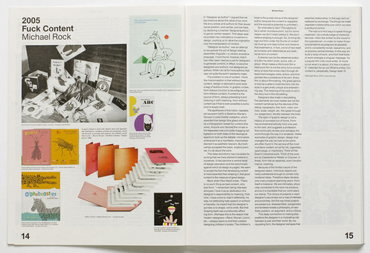
Spread showing Michael Rock’s essay “Fuck Content” written in 2005
Here, I want to concentrate on Ellen Lupton’s essay “Reading and Writing,” one of Graphic Design: Now in Production’s key texts. As chance would have it, as I skimmed the book for the first time, I started reading a section of the essay subtitled “The Reader” and within just a few lines came across this: “If you are reading this text now (and you started perusing it from the beginning, some three thousand words ago), you are a stalwart slogger indeed. The super sad truth is, this essay is a last-ditch effort at so-called ‘long-form writing.’”
Wow. That’s quite a statement in a publication that presents the presumed reader with tens of thousands of words of text. As well as the intro and 18 essays, there are many detailed captions packed tightly around a mother lode of illustrated design projects. This is an amazing amount of trouble to go to as a curator, editor and writer if you doubt that many people will make the effort to read, though just a few lines earlier Lupton has cited a novelist who observes that in a culture of self-expression, many today would rather write than read.
Call me a slogger, but back to the beginning I went. I’d intended to read the essay anyway. Now I wanted to see how Lupton arrived at her moment of doubt and where she went after that. She does a characteristically detailed and thorough job of tracing the relationship between ideas about authorship and graphic design, and the piece is enjoyably written — she obviously cares about the craft of writing and her style is warmer than it used to be. She covers familiar ground that needs to be included (Barthes, Foucault, Michael Rock on authorship, Quentin Fiore, Bruce Mau) and shows a spectrographic command of developments today, from novels featuring visual embellishments to the inherent linearity of the e-book. Nevertheless, she had raised the stakes with her “last-ditch effort” remark and I wanted to know what this ambivalence really signifies for her as both a designer and a writer, and as someone with the skills to deliver a long-form essay.
It could be that her occupation of both roles at once, when those roles might be at odds, makes it harder to achieve a clear point of view here. The issues surrounding reading (and thus writing) that Lupton raises have been with us for decades; they are just more visible and critical now. From Neil Postman’s Amusing Ourselves to Death (1985) to Sven Birkerts’ The Gutenberg Elegies (1994) to Nicholas Carr’s The Shallows (2010) cultural critics have clanged the alarm about the fate of reading in an electronic age. Lupton doesn’t cite them, though she does find space for the “conversational turn” in contemporary design writing (questionable) and for Jakob Nielsen’s research into iPad and Kindle reading speeds. While issues to do with the future of reading do possess a design dimension, addressing them largely from a designer’s perspective, as Lupton does, misses some central points.
Critics such as Postman, Birkerts and Carr ask what it is that longer texts allow writers to do that can’t be achieved in any other way, and what potential benefits this kind of reading may have for the reader. These are considerations that we lose sight of at our peril. If in the future such writing ceases to be possible, except as an undersubscribed minority pastime, because readers have been encouraged to abandon it by technology abetted by design, then the next question must be: what implications does this loss have for a culture that used to be underpinned and enriched by these forms of inquiry, thought and learning?
The structure and scope of Lupton’s essay, her careful accumulation of evidence, and the appearance (at least) of sustained logical argument, presuppose that long-form writing and reading do have a special value. For all its excitingly overloaded contemporary design-ness, the whole catalogue shares this perspective. The Google image-search hyperactivity is confined to its visual pages. Between these hotspots the columns of well-designed, continuous text look like they are meant to be read.
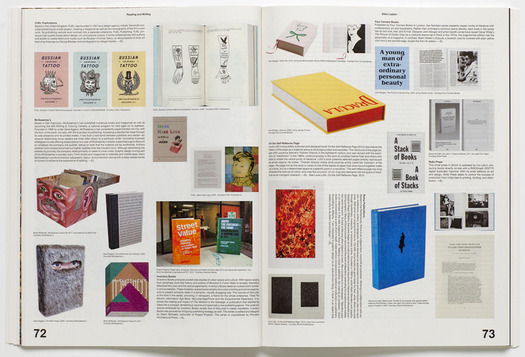
Spread from the image pages of Ellen Lupton’s essay “Reading and Writing”
Lupton notes that the “lateral spread of publishing may have degraded its status overall,” and concludes that, “Today’s all-access mediascape has flattened out many areas of expertise, casting shadows of doubt upon the future of journalism, graphic design, book publishing, and other specialized practices.” Yes, that’s how it is now. For anyone who values those fields (never mind seeks a life of productive and satisfying work in them) it sounds like the makings of a cultural meltdown, if not disaster. In their place, Lupton brings her essay to a close with a dispiritingly solipsistic vision of designers engaged in self-publishing not because there is something significant they have to say — they hardly expect to be read anyway — but for the pleasure of the activity, and as a convenient tool for “disseminating the self” and putting it “on display.” All that’s really required of the non-reading audience (which is whom exactly?) is to take note of the output’s existence.
That conclusion sounds uncomfortably like an endorsement, however tepid, though I don’t actually believe that Lupton could be happy with a future in which the long-form essay expired from lack of committed readers. It would be an impoverishment, pure and simple. If the disenchantment with sustained reading is a problem and graphic designers have any useful role to play in supporting the activity, then why not say so? The wistful, “well, it’s going to happen anyway” resignation of her “stalwart slogger” quip seems by this point to have permeated the essay, leaving it without an incisive critical position. Count me in with the sloggers.


Comments [8]
Just kidding! I think the long-form is making a comeback, with sites like Longform and Longreads and services such as Instapaper and Read-It-Later, I think we are seeing more engagement with it on the web. And as tablet devices and e-ink devices improve, it'll definitely survive.
See http://www.niemanlab.org/2011/05/making-longreads-more-social-on-the-web-and-in-the-store/
01.09.12
06:26
I think the essay had a plea to retain the value of a meaningful text in a world that appears to be driving towards an excess of writing and drought of reading.
01.11.12
11:11
01.12.12
05:52
01.12.12
07:48
01.13.12
08:21
01.13.12
11:57
i'm actually not a fan of the heavily atomized page of extended captions and short pieces. too often, these are thrown together willy-nilly, indicative not of lazy readers but of lazy writers and editors unwilling to spend the time constructing a singular, sustained argument, and then using the excuse that there's not an audience for one. (not you, ellen.)
when i come across a book with so many little bits that i'm supposed to "browse," i'm more likely to become quickly frustrated, and move on to something else.
01.13.12
04:36
So we come back to the old question: does the design audience (or enough of it) want this? And it’s this uncertainty about the reader’s needs or patience that we see in Ellen’s essay, and in her concern about “those endless columns of unbroken text.”
I do think it’s possible to strike a balance, though, and Graphic Design: Now in Production achieves that. The crammed visual pages bring order to potential chaos. They have the everything-is-in-there appeal of a parts catalog or directory (the light, floppy pages add to this impression). This is an exceptionally wide-ranging and inclusive visual document of “graphic design in an expanded field of practice.” The long captions, many of them written and signed by AB and EL, pack in a massive amount of painstakingly gathered supplementary information.
01.14.12
05:41