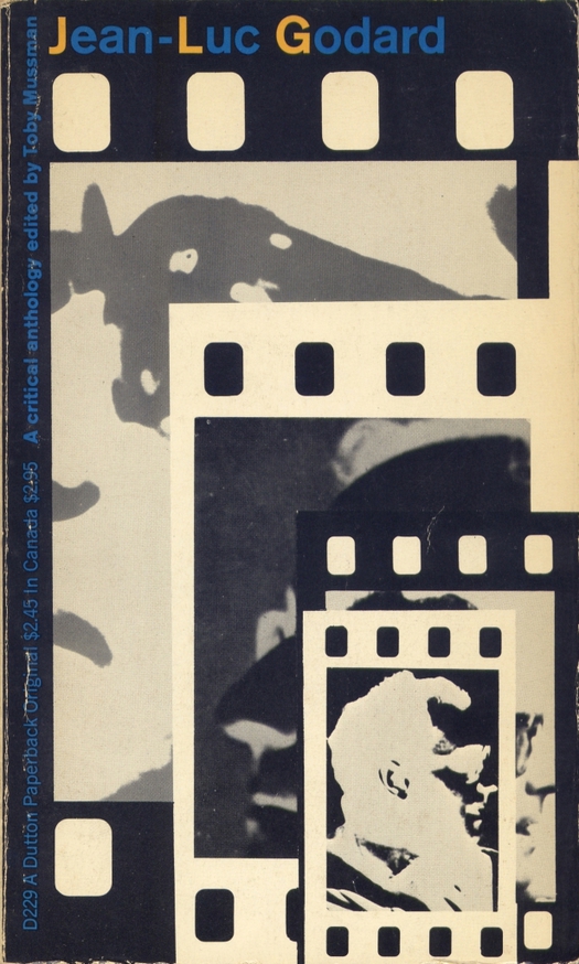
Jean-Luc Godard: A Critical Anthology, Dutton, 1968. Designed by Lawrence Ratzkin
This critical anthology of writing about Jean-Luc Godard is a new arrival on my shelf. I saw it reproduced in a post by John Gall, a cover designer based in New York whose work I admire. Published in 1968 at a time when Godard was arguably the most innovative director on the planet, producing one audacious film after another, it was one of the first books about him to appear in English. You can still find copies and I ordered it immediately through Amazon. Old paperbacks are often tatty, but this one is in very good condition for its age.
Godard is a favorite director and I wanted the book as a reference. The cover was an added delight. I once wrote an essay in praise of imperfection in design — a quality I still value highly — and this design by Lawrence Ratzkin is a great example of what I was getting at. The modernist sans serif type is typical of its era, but picking out Godard’s initials in yellow to form a monogram is not just non-doctrinaire (if we want to get all Swiss about it) but peculiar. Still, I think it works. Running the rest of the type up the edge, including the hapless editor’s name jammed into the top-left corner, in hard-to-read blue on black, is not so easy to justify. Toby Mussman was a tolerant man, or more likely he didn’t have a say.
This unsatisfactory solution was clearly a trade-off. Ratzkin wanted his image concept to bulk as large as possible and not be simply an illustration loosely moored within the cover’s frame. The overlapping rectangles lock into the corner bracket formed by the type and play off the edges of the book. Ratzkin takes the cliché of the sprocket hole, often used at the time as a graphic synecdoche for the film image, and makes it something new. Superimposed fragments of film and alternating black and white voids animate the image and throw it off balance. The four views of Godard, each one treated differently (half tone, negative, posterized and solarized) represent the contributors’ diverse perspectives on the director, while signaling Godard’s essayistic exploration of film as a medium, and the exceptionally graphic nature of his cinematic sensibility. This one of a kind cover, almost an anti-cover, feels cerebral yet improvised, considered yet casual, just like one of Godard’s exhilarating, mold-breaking, unclassifiable films. The separate layers form a series of masks — who is Godard? — that never quite resolve into an immediately legible image.

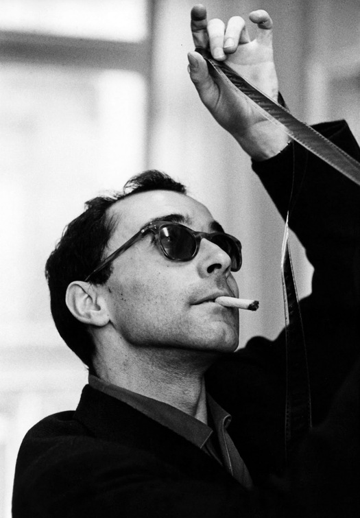
Jean-Luc Godard, mid-1960s
Jean-Luc Godard, mid-1960s: celluloid film as cultural fetish
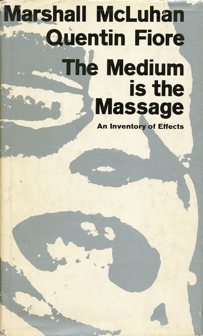
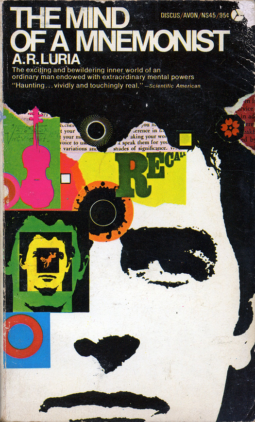
It was easy to find the source picture for the two larger images of Godard used by Ratzkin (top photo above), though I have been unable to track down the smaller picture. There is a clear relationship between Ratzkin’s posterization of the largest of the four portraits and the hardback dust jacket of Marshall McLuhan and Quentin Fiore’s The Medium is the Massage, published in 1967. Fiore prints the positive areas of the face in silver; Ratzkin goes for gray. This fashionable graphic technique was used in the famous images of Che Guevara created by Jim Fitzpatrick and others, which began to appear at this time. The same device occurs on the cover of A.R. Luria’s The Mind of a Mnemonist, published in 1968, and this unknown designer also employed inset repeated images. Effective graphic ideas never fail to spread quickly.

The Medium is the Massage, Random House, 1967. Designed by Quentin Fiore
The Mnemonist, Avon Books, 1968. Designer unknown. Source: Montague Projects
Lawrence Ratzkin died in May 2011 — there was a notice in the New York Times, though not a full obituary. He was born in 1931, studied at The Cooper Union, and in a long career as a designer created hundreds of covers notable for their great variety of graphic approaches and for frequent quirkiness. (As chronicler and critic of cover designs for J.G. Ballard’s Crash, I have to say that his weird version was not his finest hour.) Ned Drew and Paul Sternberger show two fine examples of Ratzkin’s work in By Its Cover: Modern American Book Cover Design (2005). The AIGA archive has examples of his designs, as does Flickr; the Internet Speculative Fiction Database has some of his science fiction covers. In the 1960s, he designed covers for Harper’s magazine. After he retired, he devoted his time to photography.
In 1997, in a letter to the New York Times, Ratzkin expressed his dismay at the state of book publishing. I hope it heartened him in later years that bold and original work such as his Godard cover was starting to be appreciated by a new generation of imaginative cover designers.
See also:
Speculative Fiction, Speculative Design

