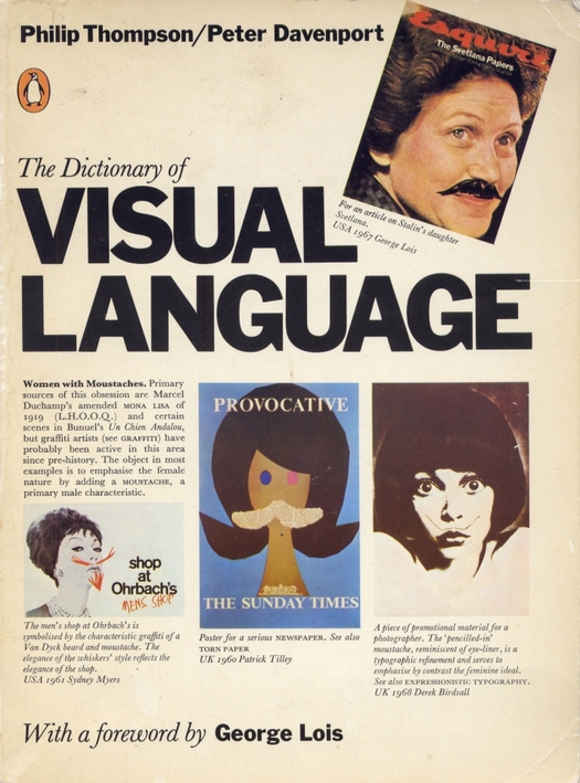
The Dictionary of Visual Language, written and designed by Philip Thompson and Peter Davenport, Penguin, 1982
I have contributed a list of 20 books every graphic designer should read to Steve Kroeter’s Designers & Books website, which is rapidly growing into a wonderful resource. There is also an interview with me about books on the Designers & Books blog.
One of the titles I have chosen is The Dictionary of Visual Language. The text that follows below is a short piece I wrote about this design classic for the “Archive” feature in Eye no. 11 in 1993 — my opinion of the book, which was first published in 1980, remains as high as ever. I wrote about the dictionary again in a recent essay titled “Love of Lexicons” in Eye no. 78, winter 2010. It’s good to see that Angus Hyland of Pentagram, whose book list is online today, has also selected the dictionary for Designers & Books.
Philip Thompson and Peter Davenport’s original title for the book was “The Dictionary of Graphic Clichés,” until they bowed to their publisher’s request for something that sounded more positive. In some ways this was a pity because, as Thompson argues in his introduction, the effectively redeemed cliché is, historically, the very crux of graphic communication, and it is the “international and trans-cultural acceptance of the visual cliché that is its greatest virtue.” First published by Bergstrom and Boyle, the book has been out of print in Britain since the Penguin edition of 1982. It deserves immediate reissue because its analytical method is unique.
“Graphic design is a language,” writes Thompson. “Like other languages it has a vocabulary, grammar, syntax, rhetoric.” To demonstrate this thesis the authors assemble a huge array of visual examples under an alphabetical sequence of subject headings: barrel, basket, bath, bayonet, beach . . . feather, fence, fig leaf, figurehead, file . . . mousetrap, moustache, mouth, mug shot. The effect is to make the reader see familiar material drawn from four decades of graphic design from a largely unfamiliar angle: not as the portfolio masterpieces of individual designers, but as part of the broader stock of visual culture in which we all share.
The dictionary also serves as a sobering reminder of how much graphic design has changed in the last decade. It is not that the visual language it explores so thoroughly has disappeared, since clichés by their nature will persist, but these devices come now with a great deal more graphic and typographic paraphernalia attached. They are less central — which is probably what older designers mean when they repeatedly bemoan the dearth of “ideas.”
See also:
An article about making book lists. Plus, an earlier design (and visual culture) book list.


Comments [8]
Once again, you are turning me on to things / people I've never heard of. Like Steve Heller and Mirko Ilic.
Have to remark: Am surprised that they didn't include this book in The Anatomy of Design. That would have been awesome!
Maybe there will be room in their "Volume II?"
VR/
05.10.11
09:11
Writing is hard. Apologies.
VR/
05.10.11
10:25
The Anatomy of Design, published in 2007, is organized differently from the dictionary, but it undertakes a comparable visual analysis of the recurrence of certain graphic ideas, or clichés.
05.11.11
08:20
05.11.11
10:09
Robert Zaharychuk Print Design http://www.printdesigner.ca
05.11.11
08:21
It reminded me of another reference book I used to see lying around studios and at art school. It had photos in in. Tiny photos. Remember Einstein with his tongue sticking out, Marilyn Monroe, photos of paintings, photos of drawings, photos of War -- those construction workers from the 40s eating lunch on a girder 20(?) stories up, &c.
Think it was the Bettman Archive and it was about 100 pages. All black and white. But can't find out if that was the real name. Anyone remember that book?
Thanks again Rick.
VR/
05.18.11
07:51
Wow - talk about esoteric Post Modern psycho babel.
The author applies grid structures to many assorted signs without articulating why it is significant? Anyone could come in after the fact and assign a grid to anything. The other thing is many of the photographs of the signs are really small therefore I needed to get my 4x readers out. What was difficult about these small images is they were comparatively analyzing each other for assorted reasons while I couldn't tell what I was comparing because many of the images were smaller than one inch.
I was so excited to get this book. I started reading it and realized it was coming from an academic who seemed more proud of an expansive vocabulary wrapped up in esoteric vernacular. As an academic I can usually handle this, but it was to much.
I did appreciate how social, political and historical events were tied in with the evolution of the roadside sign.
I wish I didn't need to be such a downer. Perhaps Rick can explain why he recommended this one?
Swiss
05.19.11
08:24
05.19.11
10:39